
Understanding the physical mechanics of image types, file formats and DPI (dots per inch) is very confusing, even for some experienced graphic designers and marketers. In this article, I will attempt to make these topics easier to understand. Through better understanding you will be able to ask for, deliver and evaluate the artwork you buy and manage for your brands.
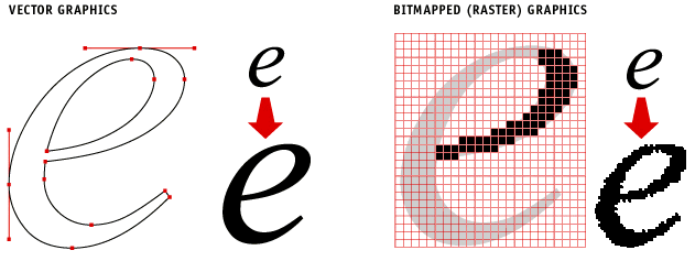 Notice the quality difference of the line edges in vector artwork compared to raster artwork.
Vector vs. Raster Art
There are two basic types of artwork. Regardless of what program is used to create them, edit them or place them it all boils down to these two types: Vector and Raster. The differences are significant and important to understand so you ask for the right kind from your agencies and creative resources. And, to ensure you deliver the right kind for the type of graphic application.
Vector Art
Vector art is best described as mathematical points in space, and the characteristics of the lines that connect those points. This is really basic Trigonometry. The line that connects any two points can be described by Sine, Cosine and Tangent formulas that result in a curve or compound curve between those points. String enough of these points and curves together in just such a way and you end up with letter forms, logos, or most any shape that is referred to in the graphic design industry as “line art”. Vector art is used when making text, logos, mechanical or precision drawings (like AutoCAD), and 3D modeling/animation (like 3D Max, Cinema 4D and Maya). Conversion of vector to raster is fairly simple, though vice versa can be difficult without specialist software due to the mathematics involved. Recently “vectorize an image online for free” tools have become available to the public allowing many to convert raster images to vectors with a degree of success. Vector graphics are also used for advanced LED displays for advertising and marketing purposes, think about the improvement of displays seen in New York Time Square. You see some examples of these displays on pages like SNA Displays.
Advantages:
- Cleanest line and image quality
- Infinitely scalable up or down in size without loss of image quality
- Supports 4-color process AND Pantone® color printing
- Smallest “K” or Kilobyte file size
- Easy to edit line shapes and quality
Disadvantages:
- Cannot be used for continuous tone photographs
- Tends to deliver a flat visual appearance
![]()
The continuous tone photo of this bee is actually made up of thousands of individual dots (pixels) of colors
Raster (Bitmapped) Art
Raster artwork is what we know as continuous tone photographs. While photos look beautifully smooth in their transitions between light and dark, color and shape, they are actually made up of very small dots (pixels) of solid color. Each dot is described by a series of numbers that the computer knows to as a certain hue of the visual spectrum and then displays that tiny zone with that specific color. The origins for this method of digitizing photographs began with the Artist George Seurat who painted using tiny little dots of color that, when viewed at a distance, visually blended to become photographic images. Blues and yellow would be visually blended by our eyes to become green. The light mechanics of this illusion are still used in today’s computer monitors and printing techniques. The important thing to keep in mind when using Raster art is the DPI or Dots Per Inch used in the image. That means how many rows of dots (pixels) there are per linear inch of the image. The more dots, the more detail and therefore, the higher quality of the image. Computer screens can only show 72 DPI on average. This is commonly called “screen resolution” or “low resolution”. Printing prefers 300 DPI “print resolution” or otherwise called “high resolution” raster artwork to achieve high quality printed photos. There is no limit to how high resolution of an image can go, but at some point, the DPI is higher than the display or print method can show so there is no value in going higher in DPI. The higher you go, the larger the file size and the longer it takes to edit, process and print the image.
Advantages
- Enables continuous tone photographs
- Supports unlimited effects in Photoshop and similar editing software
- Can also show text, logos and other line art provided thet art does not need to scale up in size
- Standard file type for web site graphics and artwork viewed on computer or mobile device screens only
Disadvantages:
- Only supports 4-color process printing
- Can only scale down in size without sacrificing quality
- Larger file size “K” compared to Vector art
Scaling Up and Down
Vector images can scale up or down infinitely in size without losing any image quality. Raster images can only scale down without losing image quality. Scaling them up in size only makes the dots of color larger and quickly those dots stop blending and become squares of color that make images look “Pixelated”.

If you start out with the image quality on the right, you cannot improve its DPI to look like the one on the left. You have to start with 300 DPI detail to begin with.
Garbage in/Garbage Out
This phrase is commonly used in the brand design industry to describe the frustrations experienced by those who start out with a poor quality image, like one that is low resolution, poor color quality or the wrong file type, and try to make them into something better. If you start with a 72 DPI image, you cannot magically turn it into a beautiful 300 DPI image. The computer can scale down (reducing dots and detail by taking them out) but it isn’t able to add DPI and detail that isn’t there. Computers are not creative. They are mathematical. If dots of color are there, they can take some away. But, if they don’t exist, they don’t know how to add more to create added detail to a photo. Human creativity has to do that. Most people can relate to having a photo on a page, trying to make it bigger, and then seeing the pixelation happen. You can scream in frustration at the dilemma, or, you can simply start with higher quality images of the right file type first and enable yourself to deliver beautiful designs in the end.
How To Know What File Type Is Right For Your Use?
The answer here is, there is no easy answer. The best thing to do is consult your design professional about the right file type and DPI needed, based on how your artwork will be used so you get quality from day one, and avoid the unpleasantness of the garbage in/garbage out reality.